PivoGraph
Examples Updates Validation Developers About
Language
  • English
  • 中文
Open PivoGraph

Example gallery

Scientific graph examples you can edit

Each example is a complete local-first project: inspect the finished figure, read how it is structured, or open an editable copy and replace the synthetic data.

18 editable examples
All (18) Comparison (7) Relationships & trends (4) Distributions (1) Time course & survival (2) Composition (3) Heat maps & matrices (1)

Comparison

7

Compare groups, treatments, paired observations, and statistical contrasts.

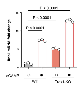
Ifnb1 Induction by Genotype and cGAMP — Column bar graph · Mean ± SD

Column bar graph · Mean ± SD

Ifnb1 Induction by Genotype and cGAMP

Ifnb1 fold change across wild-type and Trex1-knockout cells with vehicle or cGAMP. Bars, individual points, and mean ± SD show the four synthetic groups; pairwise P values are manually placed annotations.

  • bar chart
  • scatter
  • mean sd
  • group comparison
  • immunology
  • fold change
  • manual significance
Edit a copy →
p-tau181 Levels Across Cohorts — Box & whiskers · Welch t-test

Box & whiskers · Welch t-test

p-tau181 Levels Across Cohorts

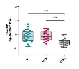
Synthetic log10(p-tau181) values for AL, ATTR, and control cohorts, shown with box-and-whisker summaries and individual observations. The two comparisons against control use Welch's unpaired t-test calculated from this example.

  • box plot
  • scatter
  • welch ttest
  • biomarker
  • cohort
  • neurology
  • significance
Edit a copy →
Aging-Related Genes across Tissues — Interleaved bars · Mean ± SD

Interleaved bars · Mean ± SD

Aging-Related Genes across Tissues

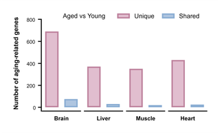
Synthetic counts of aging-related differential genes in brain, liver, skeletal muscle, and heart. Interleaved bars separate tissue-specific genes from genes shared across all four tissues.

  • grouped bar
  • interleaved bars
  • aging
  • differential expression
  • tissue comparison
  • gene counts
  • multi organ
Edit a copy →
Paired Intraocular Pressure Change — Before-after · Paired t-test

Before-after · Paired t-test

Paired Intraocular Pressure Change

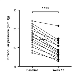
Baseline and week-12 intraocular pressure measured in the same synthetic eyes. Connecting lines preserve each pair, and the significance annotation comes from the paired t-test calculated on this table.

  • before after
  • paired
  • paired ttest
  • within subject
  • ophthalmology
  • longitudinal
  • significance
Edit a copy →
Serum AST in a Synthetic NASH Study — Scatter plot · Welch t-test

Scatter plot · Welch t-test

Serum AST in a Synthetic NASH Study

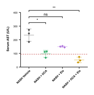
Synthetic serum AST values for vehicle, OCA, Ela, and combination groups in a NASH mouse study. Individual values are paired with mean and SD; Welch comparisons against vehicle and a healthy-baseline reference line are shown on the graph.

  • scatter
  • mean sd
  • welch ttest
  • reference line
  • nash
  • liver
  • pharmacology
  • group comparison
Edit a copy →
Glycolysis Gene-Set Enrichment Scores — Column bar graph · Mean ± SD

Column bar graph · Mean ± SD

Glycolysis Gene-Set Enrichment Scores

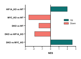
Synthetic normalized enrichment scores for HALLMARK_GLYCOLYSIS across HIF1A, MYC, and double-knockout contrasts. Horizontal diverging bars extend from zero, with manually renamed Up and Down legend entries.

  • horizontal bar
  • diverging bar
  • gsea
  • nes
  • glycolysis
  • gene set
  • zero baseline
  • comparison
Edit a copy →
Seizure-Reduction Response Thresholds — Interleaved bars · Mean ± SD

Interleaved bars · Mean ± SD

Seizure-Reduction Response Thresholds

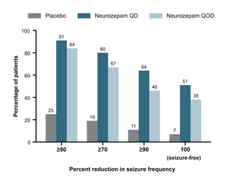
Synthetic patient response rates for placebo and daily or alternate-day Neurozepam at ≥50%, ≥70%, ≥90%, and seizure-free thresholds. Interleaved bars carry direct value labels for rapid comparison.

  • grouped bar
  • interleaved bars
  • response rate
  • threshold
  • epilepsy
  • placebo
  • clinical trial
  • value labels
Edit a copy →

Relationships & trends

4

Explore associations, fitted trends, dose–response curves, and multivariable encodings.

KRAS Inhibitor Dose–Response in Organoids — Points with error bars · 4PL fit

Points with error bars · 4PL fit

KRAS Inhibitor Dose–Response in Organoids

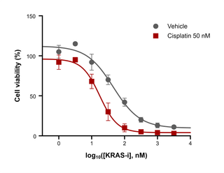
Synthetic PDAC organoid viability across a KRAS-inhibitor titration, shown for vehicle and 50 nM cisplatin conditions. Points report mean ± SD, with variable-slope 4PL curves fitted on log10 concentration by PivoGraph.

  • dose response
  • 4pl
  • nonlinear regression
  • mean sd
  • error bars
  • organoid
  • oncology
  • curve fit
Edit a copy →
KEGG Pathway Enrichment Bubble Plot — Bubble plot · Size + color encoding

Bubble plot · Size + color encoding

KEGG Pathway Enrichment Bubble Plot

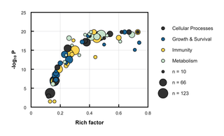
KEGG pathway enrichment for a synthetic set of differentially expressed tumor-cell genes after treatment. Rich factor and −log10 P set position, hit count sets bubble area, and pathway class sets color; size-legend labels are illustrative rounded values.

  • bubble plot
  • pathway enrichment
  • kegg
  • p value
  • size encoding
  • color category
  • omics
  • oncology
Edit a copy →
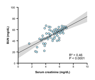
Creatinine and BUN Linear Regression — Points only · Linear regression

Points only · Linear regression

Creatinine and BUN Linear Regression

Synthetic serum creatinine and blood urea nitrogen measurements shown as an XY scatter plot. The least-squares fit, 95% confidence band, R², and P value are calculated from this example in PivoGraph.

  • scatter
  • linear regression
  • confidence band
  • r squared
  • p value
  • clinical chemistry
  • kidney
Edit a copy →
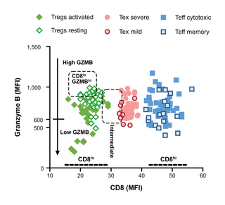
CD8 and Granzyme B across T-Cell Subsets — Points only · Mean ± SD

Points only · Mean ± SD

CD8 and Granzyme B across T-Cell Subsets

Synthetic CD8 and Granzyme B MFI values for six illustrative T-cell subsets, paired as filled and open symbols. Dashed gates, threshold marks, subgroup labels, and directional annotations demonstrate manual figure annotation rather than statistical output.

  • scatter
  • flow cytometry
  • gating
  • t cell subsets
  • immunology
  • manual annotations
  • threshold
Edit a copy →

Distributions

1

Show data shape, medians, quartiles, and variability.

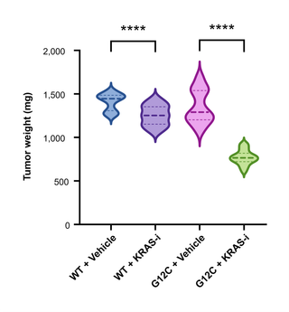
KRAS PDX Tumor Weight Distributions — Violin plot · Welch t-test

Violin plot · Welch t-test

KRAS PDX Tumor Weight Distributions

Endpoint tumor-weight distributions for synthetic KRAS wild-type and G12C PDX groups under vehicle or KRAS-inhibitor treatment. Violin shapes include median and quartile lines; both genotype-specific comparisons use Welch's unpaired t-test.

  • violin
  • distribution
  • median
  • quartiles
  • welch ttest
  • pdx
  • tumor weight
  • oncology
Edit a copy →

Time course & survival

2

Track change over time and time-to-event outcomes.

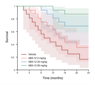
ABX-12 Kaplan–Meier Survival Curves — Staircase, points · 95% CI

Staircase, points · 95% CI

ABX-12 Kaplan–Meier Survival Curves

Kaplan–Meier survival for vehicle and three synthetic ABX-12 dose groups, with 16 observations per group and time in months. Staircase curves are accompanied by 95% Greenwood log-log confidence bands.

  • kaplan meier
  • survival
  • confidence band
  • time to event
  • dose groups
  • oncology
  • greenwood
Edit a copy →
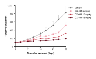
Tumor Volume over Time by Dose — Points & line with error bars · Mean ± SEM

Points & line with error bars · Mean ± SEM

Tumor Volume over Time by Dose

Synthetic mouse xenograft volume measured over 28 treatment days for vehicle and three CX-401 dose groups. Connected points show mean ± SEM and make the dose-dependent trajectories easy to compare.

  • time course
  • line chart
  • mean sem
  • error bars
  • tumor volume
  • xenograft
  • dose groups
  • oncology
Edit a copy →

Composition

3

Show how parts contribute to a total across one or more groups.

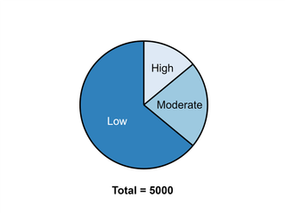
CD8 T-Cell Clone Expansion — Pie

Pie

CD8 T-Cell Clone Expansion

Synthetic infiltrating CD8+ T-cell counts divided into low, moderate, and high clonal expansion. Direct slice labels and a total of 5,000 make the composition readable without a separate legend.

  • pie chart
  • composition
  • t cells
  • clonal expansion
  • immunology
  • proportions
  • total count
Edit a copy →
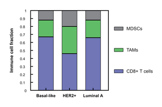
Tumor Microenvironment across Breast Cancer Subtypes — Stacked bars · Mean ± SD

Stacked bars · Mean ± SD

Tumor Microenvironment across Breast Cancer Subtypes

Synthetic fractions of CD8+ T cells, TAMs, and MDSCs in basal-like, HER2+, and luminal A tumor microenvironments. Stacked bars use fractions that already sum to one for each subtype.

  • stacked bar
  • composition
  • tumor microenvironment
  • breast cancer
  • immune cells
  • fractions
  • subtypes
Edit a copy →
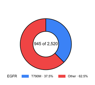
EGFR T790M Resistance Mechanisms — Donut

Donut

EGFR T790M Resistance Mechanisms

Synthetic counts of T790M and other resistance mechanisms in an EGFR TKI cohort. The donut center shows 945 of 2,520 cases, while the legend reports the two proportions.

  • donut chart
  • composition
  • egfr
  • t790m
  • drug resistance
  • oncology
  • percentages
  • center total
Edit a copy →

Heat maps & matrices

1

Compare values across two categorical dimensions using color.

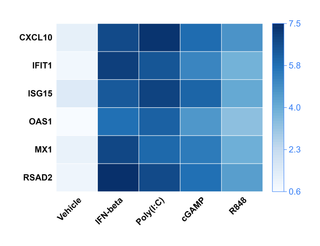
Interferon-Stimulated Gene Induction Heat Map — Heat map · Sequential color scale

Heat map · Sequential color scale

Interferon-Stimulated Gene Induction Heat Map

Relative expression of six interferon-stimulated genes across vehicle and four synthetic stimulation conditions. A sequential blue scale encodes the example log2-scale values without clustering.

  • heatmap
  • gene expression
  • sequential colors
  • matrix
  • immunology
  • treatment comparison
Edit a copy →

These examples use synthetic data created to demonstrate plotting and analysis workflows; the relationships shown are not research findings.

Privacy Terms Examples Updates Validation About
Language
  • English
  • 中文

© 2026 PivoGraph. All rights reserved.